Still Listening
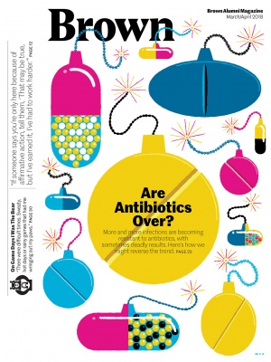
This is the second issue of our redesigned BAM, and like the owners of a new car, we’re still getting familiar with how it handles.
Our new departments, especially The Big Issue, The Big Search, and Courses of Study, are meant to bring you, briefly, into the intellectual life of campus. The operative word there is briefly. We will still explore major research and learning stories at length, but our hope is to balance those with quick takes in every issue, sacrificing some depth for brevity and quantity. It’s a tricky balance.
One of my favorite new departments is Current Obsession, with which we now close each issue. This is a chronicle of a preoccupation—again brief—told in the voice of the person preoccupied. Last issue, our editorial intern David Kleinman ’20 described his passion for Jeopardy!, his successful tryout for the show, and his excitement as he waited for the phone call—which might never arrive—to fly out to Los Angeles and actually compete, live, on camera.
As we were able to note before we went to press with that issue, the call came sooner than expected, and David flew to Los Angeles, stayed in a Jeopardy!-recommended hotel, boarded a van with the other contestants who’d been called up, and arrived at the studio on the morning of February 13, only to sit in the audience—where he ran into Catherine Ono ’09, an alumna who’d also gotten the call. A dream came true when he was called up to the stage.
When he returned to the office, we subjected David to a thorough interrogation, even though he had been warned not to reveal too much, and especially not to reveal how well he did or didn’t do on the show. Like you, we’ll find out for the first time on June 8, the date of his Jeopardy! debut.
Also in the last issue, I invited you to let us know what you thought of the redesigned BAM. Change is risky. But Brown is known for its innovative, risk-taking approach to education, and we want the magazine to reflect some of that. Most of you liked the fresh look, the more varied content, and the more frequent use of graphics.
Two things stood out as issues for some readers, however: the lightness of one of the fonts, which made some content difficult to read, and the blue underlining and arrows, which add additional facts in the margins of some articles and which a few readers thought were distracting and unnecessary.
We agree about the lightness of the sans serif font, and we are striving to correct it. You should see some improvement in this issue. As for the blue underlining, it is both an echo of the footnoting found in academic articles and a nod to the kind of nonlinear reading experience that dominates online, where a reader can click on hot links for additional information. These will also evolve as we learn to use them most effectively, but we do think they are unobtrusive enough for readers who dislike them to read right over them.
Every redesign is a work in progress. Thank you for helping us find our way with this one.
—Norman Boucher, Editor & Publisher


